How to Design an Online Store Website That Converts Visitors
Designing an online store is not the same as designing a general business website. A company website mainly needs to inform and build credibility. An ecommerce website needs to do that too,

On this pageJump to a section
A beautiful online store does not always lead to sales. Good ecommerce design should help visitors find products, trust your business, and complete their purchase easily.
This guide explains how to design an online store website that converts, from planning and product pages to checkout, mobile design, and final testing.
What makes a good online store website design?
Designing an online store is not the same as designing a general business website. A company website mainly needs to inform and build credibility. An ecommerce website needs to do that too, but it also has to guide people through a decision-making process that ends in a purchase.
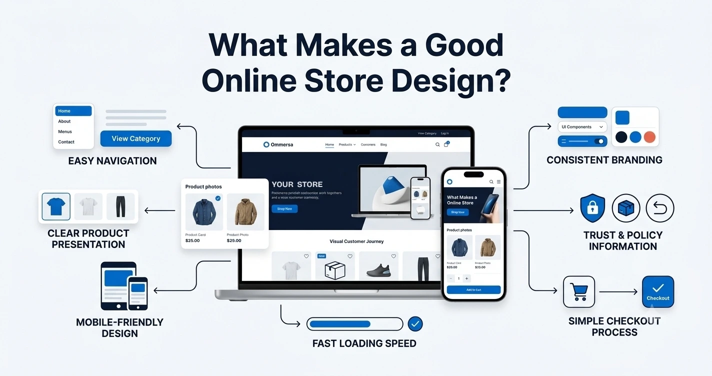
few qualities separate stores that convert from stores that just sit online:
Easy navigation – customers give up quickly if they cannot find what they are looking for.
Clear product presentation – blurry photos or vague descriptions create doubt.
Mobile responsiveness – most shopping traffic now happens on phones, so a clunky mobile layout costs sales directly.
Fast loading – slow pages test people's patience, especially on category and product pages.
Consistent visual design – mismatched fonts, colours, or button styles make a store feel unfinished.
Visible trust information – shipping costs, return policy, and contact details reduce hesitation.
A simple path to purchase – every extra click or confusing step is a chance for someone to leave.
None of these qualities work in isolation. A fast site with confusing navigation still loses customers. A well-organized site with poor product photos still struggles to convert. Good ecommerce design means all of these pieces work together.
Plan your online store before designing it
It is tempting to jump straight into picking colours and browsing templates. Resist that urge. Planning first saves you from redesigning your store a few months in, once you realize the structure does not match how customers actually shop.
Identify your products and target customers
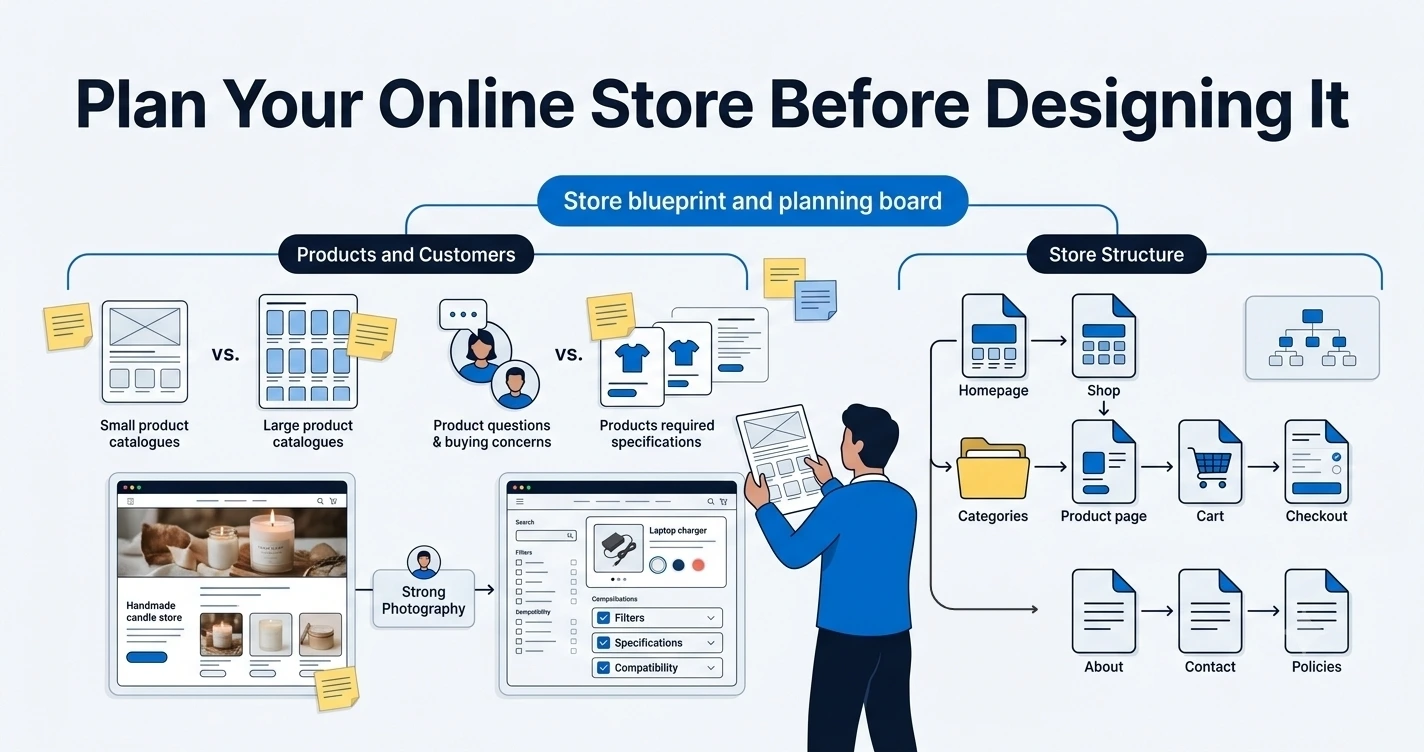
The type of product you sell should shape almost every design decision that follows. A store selling ten curated skincare products needs a different layout than one selling five hundred hardware parts.
Think about:
How many products you currently sell, and how many you expect to sell later
What questions customers usually ask before buying
Whether size, material, colour, or compatibility matters
How much explanation each product needs before someone feels confident buying it
For example, a store selling handmade candles can rely heavily on strong photography and a short, sensory product description. A store selling laptop chargers needs specification tables, compatibility details, and clear filtering by brand and connector type. Same goal, very different design priorities.
Decide which pages your store needs
Most online stores rely on a similar set of core pages, even if the content inside them varies:
Homepage – introduces the store and directs visitors to categories or offers
Shop or product listing page – shows all products, often with filters
Category pages – group related products together
Product pages – give full details on a single item
Shopping cart – lets customers review items before checkout
Checkout – collects payment and shipping information
About page – explains who is behind the store
Contact page – gives customers a way to reach you
Shipping and return policies – set expectations before and after purchase
You do not need every page to be complex. A small store can have a short, honest about page and still build trust effectively.
Choose the right platform for your online store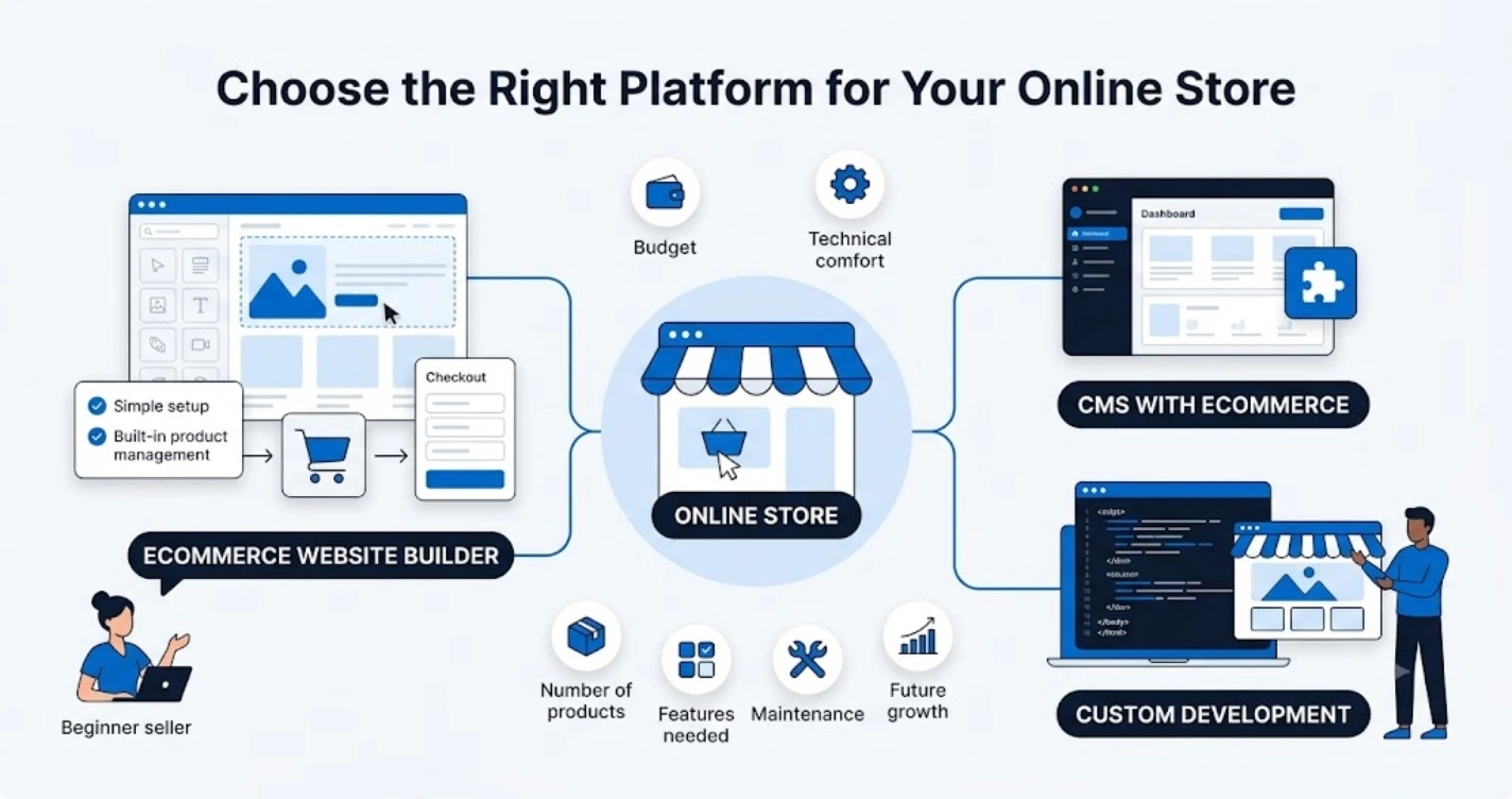
There are generally three routes for building an ecommerce website:
Ecommerce website builders – drag-and-drop platforms designed specifically for selling online, with built-in product management, cart, and checkout.
Content management systems with ecommerce functionality – general website platforms with a store feature or plugin added on top.
Custom-developed ecommerce websites – built from scratch by developers for very specific requirements.
Your choice should depend on your budget, technical comfort, number of products, the features you actually need, how much ongoing maintenance you want to deal with, and how you expect the store to grow. A beginner selling twenty products does not need a custom-built platform. A large retailer with complex inventory and shipping rules might.
Learning how to create a website from scratch does not necessarily mean writing code line by line. Many store owners build fully functional, professional-looking stores using visual editors and pre-built templates, adjusting layout, colours, and content without touching a single line of code.
Create a simple and clear website structure
Structure is what allows customers to move from "just browsing" to "ready to buy" without getting lost along the way. If people cannot predict where to find something, they assume the store is disorganized, and that impression affects how much they trust you.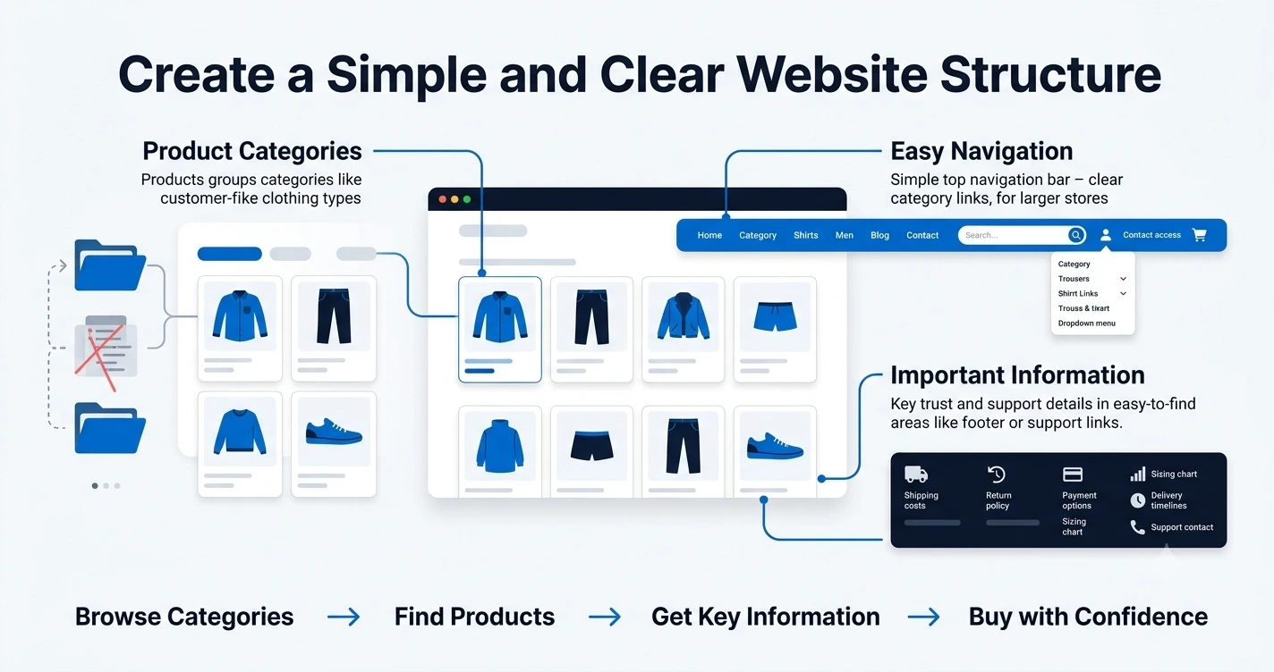
Organize products into relevant categories
Group products the way your customers think about them, not the way your inventory system organizes them internally. A clothing store might separate by type (shirts, trousers, shoes) rather than by supplier or fabric type, since that is how shoppers actually search.
Avoid these common category mistakes:
Creating too many categories, which forces customers to guess where an item belongs
Using vague labels like "miscellaneous" or "other"
Making a category for only one or two products without a clear reason to separate them
Keep the navigation easy to understand
Your main navigation should give customers quick access to the essentials: product categories, a visible search bar, account access, contact information, and the cart icon. Keep the menu short enough that a first-time visitor can scan it in a few seconds. If you sell across many categories, use dropdown menus rather than cramming everything into a single row.
Make important information easy to reach
Customers should never have to dig for shipping costs, return policies, payment options, sizing charts, delivery timelines, or support contact details. Bury this information, and people either abandon their cart or contact you with questions you could have answered upfront. A simple footer with links to these pages solves most of this problem.
Design a homepage that guides visitors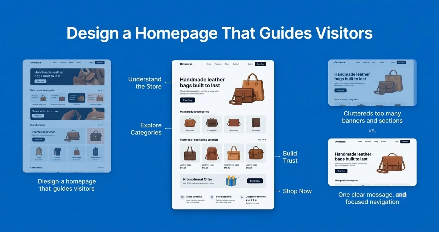
Your homepage has only a few seconds to answer four questions:
What does this store sell?
Who are the products for?
Why should someone buy here instead of somewhere else?
Where should the visitor go next?
To answer these clearly, your homepage should include a clear headline, a short value proposition, links to your main categories, featured or bestselling products, any current offers, a short section on store benefits, a few customer reviews, and obvious calls to action.
The goal is not to show everything you have. A homepage crowded with banners, sliders, and unrelated sections overwhelms visitors instead of guiding them.
Weak homepage message: "Welcome to our store. We offer a wide variety of quality products at great prices."
Improved version: "Handmade leather bags built to last. Free shipping on orders over $50."
The second version tells the visitor exactly what they are looking at and gives them a reason to keep browsing.
Design product pages that encourage purchases
Product pages carry the most weight in the buying decision. This is where interest turns into an actual purchase, or where doubt sends someone back to search results.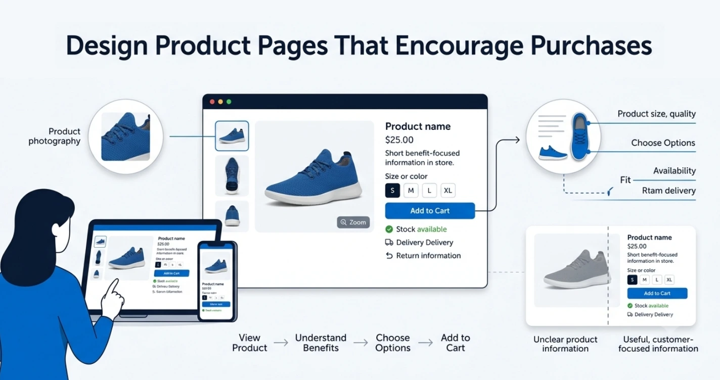
Use clear product images
Photos should be sharp, well lit, and consistent in background across your catalogue. Show multiple angles, include a zoom function if possible, and make sure the images communicate real scale, not just an idealized shot. If a customer cannot tell how big something is, they will hesitate to buy it.
Write helpful product information
Cover the essentials clearly: product name, price, main benefits, features or specifications, available variations, size or measurement details, availability, delivery information, and return terms.
There is a real difference between describing a product and helping someone decide if it is right for them. "100% cotton t-shirt" is a description. "Soft, breathable cotton that holds its shape after multiple washes" helps someone picture actually wearing it. Aim for the second kind of writing wherever you can.
Make the add to cart button easy to find
The add to cart button should stand out visually and sit near the price and product options, not buried below a long description. Use clear wording like "Add to cart" rather than something vague or clever. Too many competing buttons on the same page, such as several offers or unrelated links, dilute the one action you actually want the visitor to take.
Build trust through your website design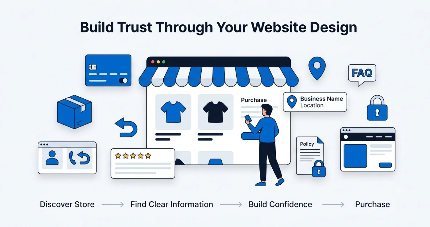
Visitors hesitate to buy from a store they do not recognize, and that hesitation is often stronger online than in person, since they cannot physically examine the product or speak to someone face to face.
Practical trust elements worth including:
Secure and familiar payment methods
Clear shipping and return policies
Real customer reviews, not just star ratings with no detail
Visible contact details, including an email address or phone number
Basic business information, such as your location or business name
A frequently asked questions section
A privacy policy
Accurate, honest product details
Consistent branding across every page
Trust badges and security icons can help, but they are not a substitute for actually being transparent. A store with a padlock icon and vague, missing policies will still make people uneasy.
Make the shopping cart and checkout simple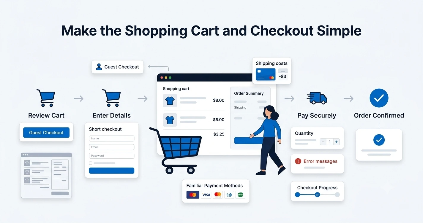
Every unnecessary step in checkout is a chance for someone to abandon their cart. This is one of the biggest points of lost sales in ecommerce, and it is usually fixable with small design changes.
Recommendations that consistently help:
Offer guest checkout so people are not forced to create an account
Ask for fewer form fields, only what you actually need
Show pricing clearly, with no last-minute surprises
Display shipping costs early, not only at the final step
Support familiar payment options people already trust
Let customers edit their cart easily without starting over
Include a clear order summary before final confirmation
Write clear error messages when something goes wrong
Use a checkout progress indicator if your checkout has multiple steps
If you already have a store, you do not need a full rebuild to fix checkout friction. Knowing how to edit a website gives you the ability to adjust form fields, rewrite confusing button text, update your order summary layout, or remove an unnecessary step, often within your existing platform's dashboard.
Design your online store for mobile users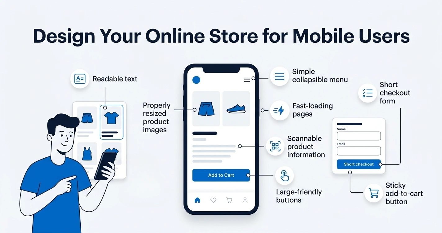
Mobile design is not simply a smaller version of your desktop layout. Screens are smaller, attention spans are shorter, and typing is more tedious, so every design decision needs to account for that.
Focus on:
Buttons large enough to tap accurately with a thumb
Text that stays readable without zooming in
Images that resize properly instead of cutting off
A simple, collapsible menu instead of a full desktop navigation bar
Checkout forms with as few fields as possible
Sticky elements, like a fixed add to cart button, where useful
Fast-loading pages, since mobile connections vary in speed
Product information formatted so it can be scanned quickly
Quick mobile usability checklist:
[ ] Buttons and links are easy to tap without misclicking
[ ] Text is legible without zooming
[ ] Images load correctly and resize to fit the screen
[ ] Menu opens and closes smoothly
[ ] Checkout form is short and simple
[ ] Pages load quickly on a mobile connection
Use consistent branding and visual design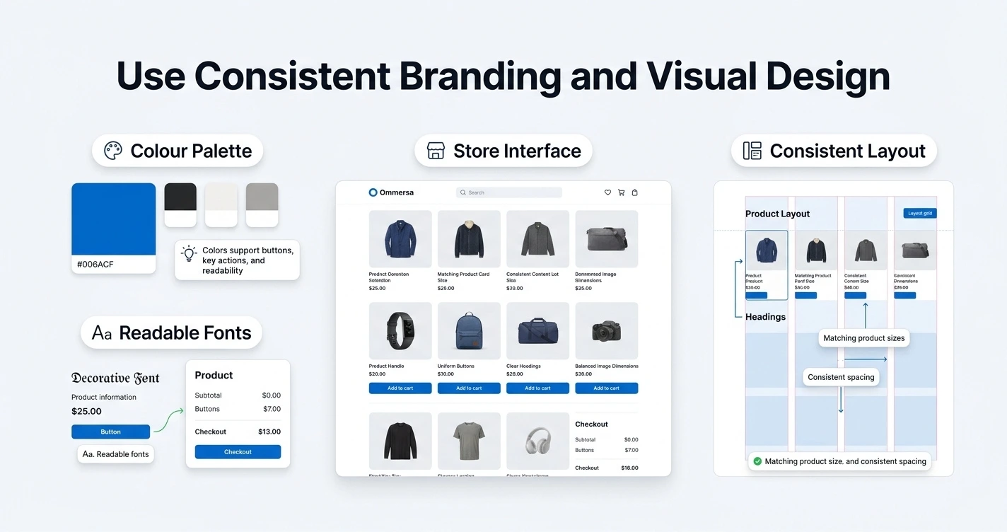
Branding should support the shopping experience, not compete with it. If your visual design distracts from the products, it is working against you.
Choose a simple colour palette
Pick one primary brand colour, a small set of neutral supporting colours, and make sure there is strong contrast between text and background. This keeps buttons and important content easy to see without turning every page into a colour clash.
Select readable fonts
Decorative or stylized fonts might look appealing in small doses, but they should never appear in product information, prices, or checkout content. Readability matters far more than personality in these areas.
Keep page layouts consistent
Use consistent spacing, button styles, headings, product card sizes, image dimensions, and content alignment across your site. When every page follows the same visual rules, the store feels more professional and easier to navigate, even if the visitor cannot articulate why.
Improve website speed and usability
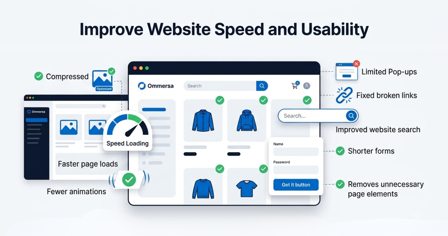
the most attractive ecommerce design loses its effect if the site is slow or frustrating to use. Speed and usability are not separate from design. They are part of it.
Practical improvements you can make without technical expertise:
Compress large images before uploading them
Remove unnecessary animation that slows down page rendering
Limit intrusive pop-ups, especially ones that appear immediately on arrival
Fix broken links regularly
Improve your website search so it returns relevant results
Simplify forms wherever they appear
Make buttons descriptive instead of generic, like "View sizes" instead of "Click here"
Remove page elements that do not serve a clear purpose
Small, boring fixes like these often improve conversions more than a full visual redesign.
Test your online store before launching
Before you announce your store to the world, test it the way a real customer would use it.
Work through this checklist:

Layout looks correct on both desktop and mobile
All navigation links work
Product search returns accurate results
Filters function correctly
Product variations, like size or colour, work as expected
Items can be added to and removed from the cart
Checkout completes without errors
Payment methods process correctly
Shipping charges calculate accurately
Confirmation emails or messages are sent
Contact forms actually reach you
Policy pages are complete and accurate
Spelling and product details are correct throughout
The most useful step here is simple: complete an actual test purchase yourself, from browsing to confirmation, exactly as a customer would. This tends to reveal small problems that are easy to miss when you are only looking at individual pages.
How to improve an existing online store design
If you already have a store, you do not need to rebuild it from scratch to improve conversions. Start by reviewing what is currently working and what is not.
Look closely at your homepage clarity, navigation, product categories, individual product pages, calls to action, mobile usability, checkout flow, page speed, common customer questions, and any analytics or feedback you have collected.
Instead of redesigning everything at once based on a hunch, pick one high-impact area, such as checkout friction or unclear product pages, and improve it first. Measure the difference, then move to the next area. This approach protects you from spending time and money changing things that were not actually a problem.
Common online store design mistakes to avoid
Cluttered homepage – too many banners and messages compete for attention, so visitors leave without a clear direction.
Confusing navigation – if people cannot find products quickly, they assume the store is not worth the effort.
Low-quality product images – blurry or inconsistent photos make products look less credible, even if the item itself is good.
Weak product descriptions – vague or generic text leaves buyers uncertain and more likely to keep comparing elsewhere.
Missing shipping details – hidden shipping costs are one of the most common reasons carts get abandoned at checkout.
Hidden contact information – customers hesitate to buy from a business they cannot easily reach.
Long checkout forms – every extra field increases the chance someone gives up before finishing.
Inconsistent visual design – mismatched styles make a store feel unfinished or unreliable.
Too many pop-ups – aggressive pop-ups interrupt browsing and push visitors away.
Poor mobile usability – a clunky mobile experience loses sales directly, since most shoppers browse from their phones.
Unclear calls to action – if it is not obvious what to click next, many visitors simply will not click at all.
How Ommersa WebStore simplifies ecommerce website design
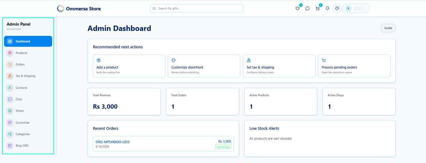
Building an online store does not have to mean dealing with complicated tools or relying on a developer for every small change. Ommersa WebStore gives beginners and small businesses a simple way to create and manage their store from one place.
With Ommersa, you can:
Add and organize products
Manage categories and store pages
Track orders from one dashboard
Start with an Ommersa subdomain
Connect a custom domain later
Update your store without coding
It handles the technical side so you can focus more on your products, customers, and sales. When you are ready to put the ideas in this guide into practice, you can start building your store with Ommersa WebStore.
Final online store design checklist
Clear, logical store structure
Simple, predictable navigation
Focused homepage that guides visitors
Helpful, detailed product pages
Mobile-friendly design throughout
Visible trust information
Simple, low-friction checkout
Consistent branding and layout
Fast-loading pages
Complete testing before launch
Conclusion
Learning how to design an online store website is not mainly about adding more visual elements. It is about reducing confusion, presenting products clearly, building trust, and making the path to purchase as easy as possible.
Your first version does not need to be perfect. It needs to be clear, functional, trustworthy, and easy to improve. Launch with the fundamentals in place, watch how real customers actually use your store, and refine it from there.
FAQs
How do you design an online store website?
Start by planning your products, pages, and customer journey before choosing colours or layouts. Focus on clear navigation, strong product pages, mobile responsiveness, visible trust information, and a simple checkout process.
What pages should an ecommerce website include?
At minimum, include a homepage, shop or product listing page, category pages, individual product pages, a cart, checkout, an about page, a contact page, and clear shipping and return policies.
How do I make a website to sell products?
Choose a platform that matches your budget and technical comfort, plan your product categories and pages, then build a simple structure with clear navigation and strong product presentation. Test everything before you launch.
Can I create an online store without coding?
Yes. Many ecommerce platforms and website builders let you create and manage a fully functional store using visual editors, without writing any code.
How should I organize products on my website?
Group products the way your customers naturally think about them, using clear category names. Avoid creating too many categories or vague labels that make browsing harder.
What makes an ecommerce website convert well?
A combination of easy navigation, clear product information, mobile-friendly design, visible trust signals, and a checkout process with minimal friction. No single element does the work alone.
How can I edit and improve an existing online store?
Review your homepage, navigation, product pages, checkout, and mobile experience for friction points, then improve one high-impact area at a time. Small, focused edits usually work better than a full redesign done all at once.
Is custom ecommerce website design necessary for a small business?
Not usually. Most small businesses can build an effective, professional store using existing ecommerce platforms and templates, reserving custom development for cases with very specific technical requirements.